

When I joined TKXS they already had some reusable components in place that were shared between the Design Team, and coded by the Frontend Team. Beyond that, there was a general idea of the Design System circulating in peoples' minds. I accepted the challenge of developing and maturing what was already there into the Design System.
We were developing the Design System along with working on TKXS's major project at that time — Corteva Enterprise system (CES). Looking back, I realize that having a real project that created demand for the components and patterns and served as a testbed for those components in real life was really essential for setting the Design system up to success.
We were developing the Design System along with working on TKXS's major project at that time — Corteva Enterprise system (CES). Looking back, I realize that having a real project that created demand for the components and patterns and served as a testbed for those components in real life was really essential for setting the Design system up to success.

So we created the new components for CES, and in parallel I was working on a structure for our Design System, combining some best practices I was familiar with at that time with our vision and the needs of the product. Here's what we landed on with the structure:
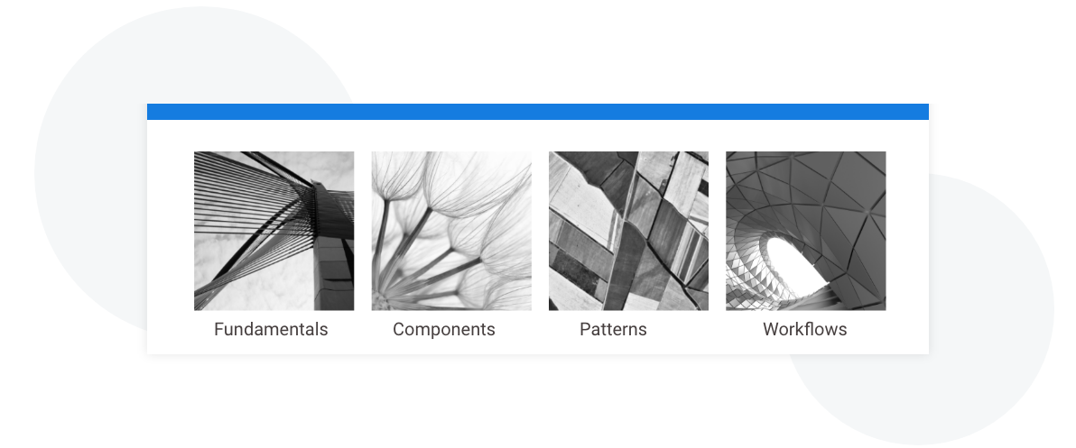
Fundamentals
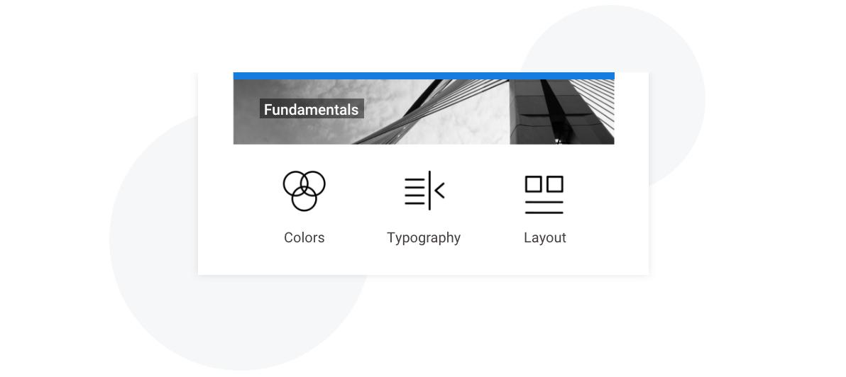
Colors
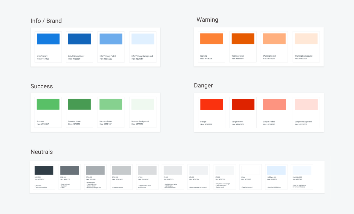
The products we were working on were data-heavy enterprise applications, so the UIs were purely utilitarian and action-focused. Since we wanted this system to be applicable both to our internal products and have the potential to be themed and branded for the clients, I suggested naming colors using semantic values we assigned to them in our system. Here's how it worked in our default CastUI theme:
Typography
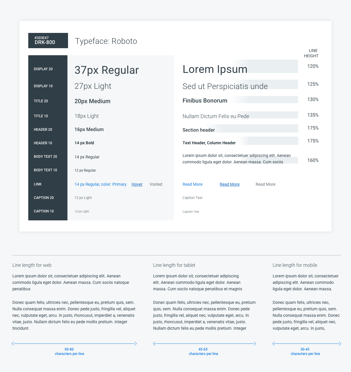
We came up with a convention that allowed for flexibility — having several styles for different header levels and using two-digit numbers to name those styles allowed us to easily add styles in between in case we needed them. We calculated the line heights for each of the styles and documented some best practices we all agreed on as a team. For our original theme, we used Roboto, and the practice showed this font's flexibility and great performance on most platforms. It might not be fancy, but it renders nicely on the vast majority of the screens and has just enough weights to serve our purposes. It performs particularly well in tables, since numbers behave as monospaced.
Layouts
We defined rules around desktop and mobile layouts, standardized spacing, so that our designs had enough white space and visual rhythm to help the user efficiently scan through the page. I think we were able to find the right balance to make our data-heavy UIs informative and not overwhelming.

Components
We created and added all the components to our UI Kit in XD. Along with the components themselves, we needed rules and guides that explain how those components are supposed to be used.
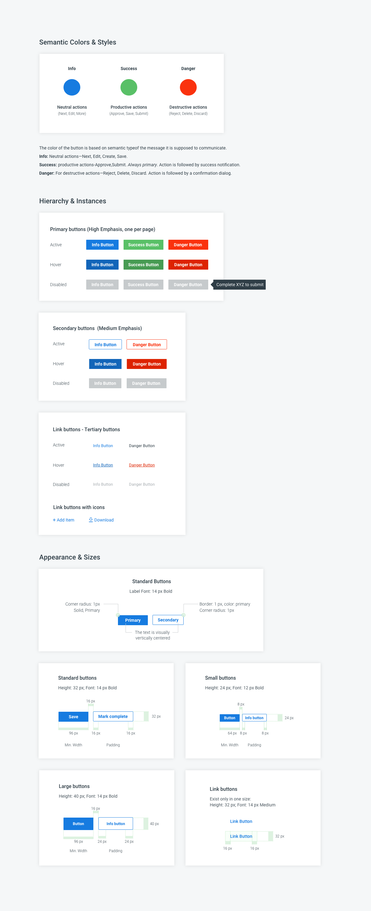
I want to show an example that illustrates how a set of components is different from a mature Design System. Buttons will be a good example to see how the color system is applied, and how the hierarchy of actions drives the button styles and guides the user through the UI.
Patterns
Patterns combine components into flows, where multiple components work together as a whole, one of the examples could be filtering on the table:
Workflows
Workflows were more specific to our products, and is a consequence of patterns. Creating new offers, editing product lists, and other action sequences associated with different stages in the offer life cycle went through iterations during design process and were turned into consistent user flows, that were used as building blocks to create consistent and recognizable patterns that reduce cognitive load and support users in their journey helping to focus on their business problems rather than figuring out how to use the software.
In addition to that, we created some internal documents that outline how the component library should be used by our team, and how to keep it updated. Here are some of the benefits that came out of the Design System:
• Speeds up our work — we didn't have to re-solution and re-create the components, which allowed us to skip the low-fidelity phase and jump from whiteboarding to high-fidelity, ready for testing prototypes.
• Promotes creativity — we can focus our mental energy on the best user experience and iterate faster.
• Brings consistency to the UI, which I believe is the core value for the good user experience.
• Improves communication within the design team, as well as with developers, product owners, and stakeholders — both internal and external.
• Helps us support our design decisions in front of the clients and adds weight and value to our team.
That was an exciting journey that helped me deeply understand the systematic approach and all the benefits that come out of it. I also wanted to add something very obvious: The Design system is something that lives and grows with the product, and you will never be done building it. But if it is set up properly, it has all the flexibility and growth potential already built-in. And I strongly believe that it was something we managed to achieve. I hear a lot from my now former colleagues that the Design System is heavily employed throughout the portfolio of products and continues growing.