
Visual standards for data science
At TKXS we had an amazing Data Science team that was working on analytics in sales and marketing and providing our clients with insights for data-driven decision-making.
Part of the job was to visualize the data with reports and dashboards, to make the insights more accessible to the users. That's where our team came into play.
Part of the job was to visualize the data with reports and dashboards, to make the insights more accessible to the users. That's where our team came into play.
It was a fun challenge. I had to remember some of the high school math to get to understand some of the visualizations, like the logarithmic scales or Pareto principle. I started by creating actual dashboards and then worked backward to document the approaches we found successful.
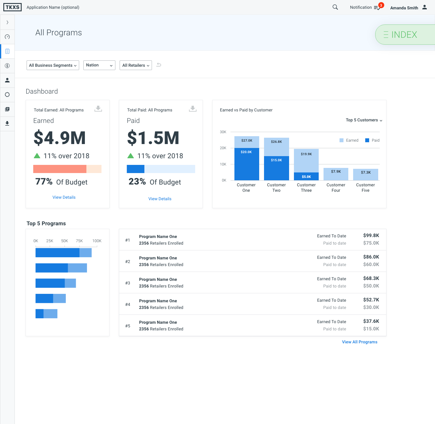
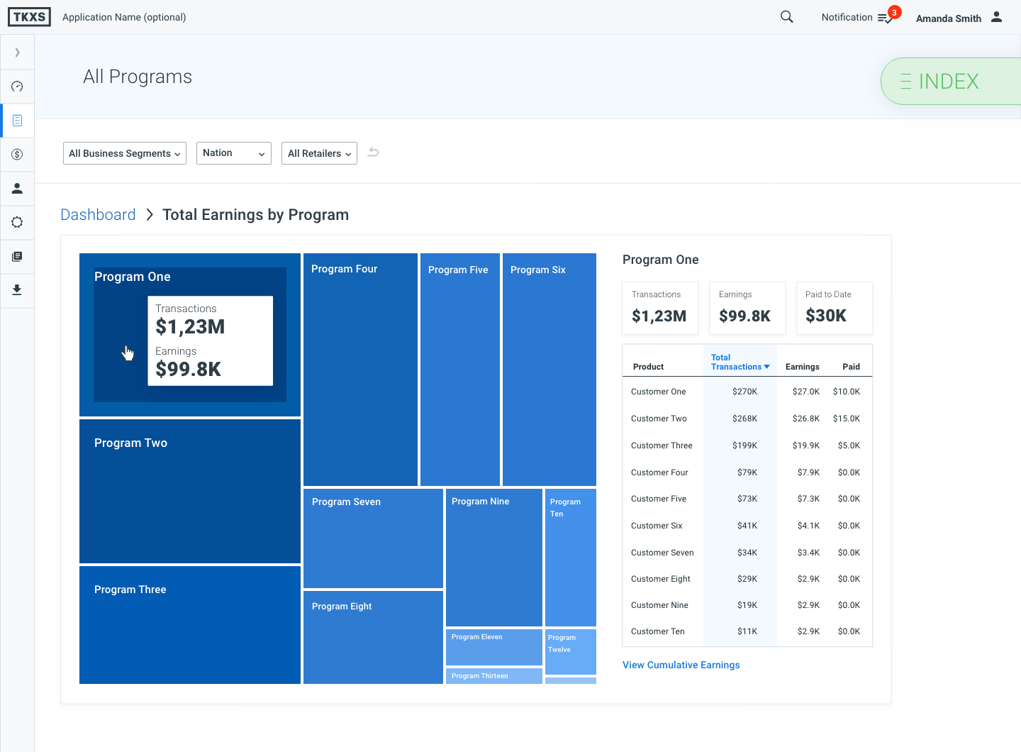
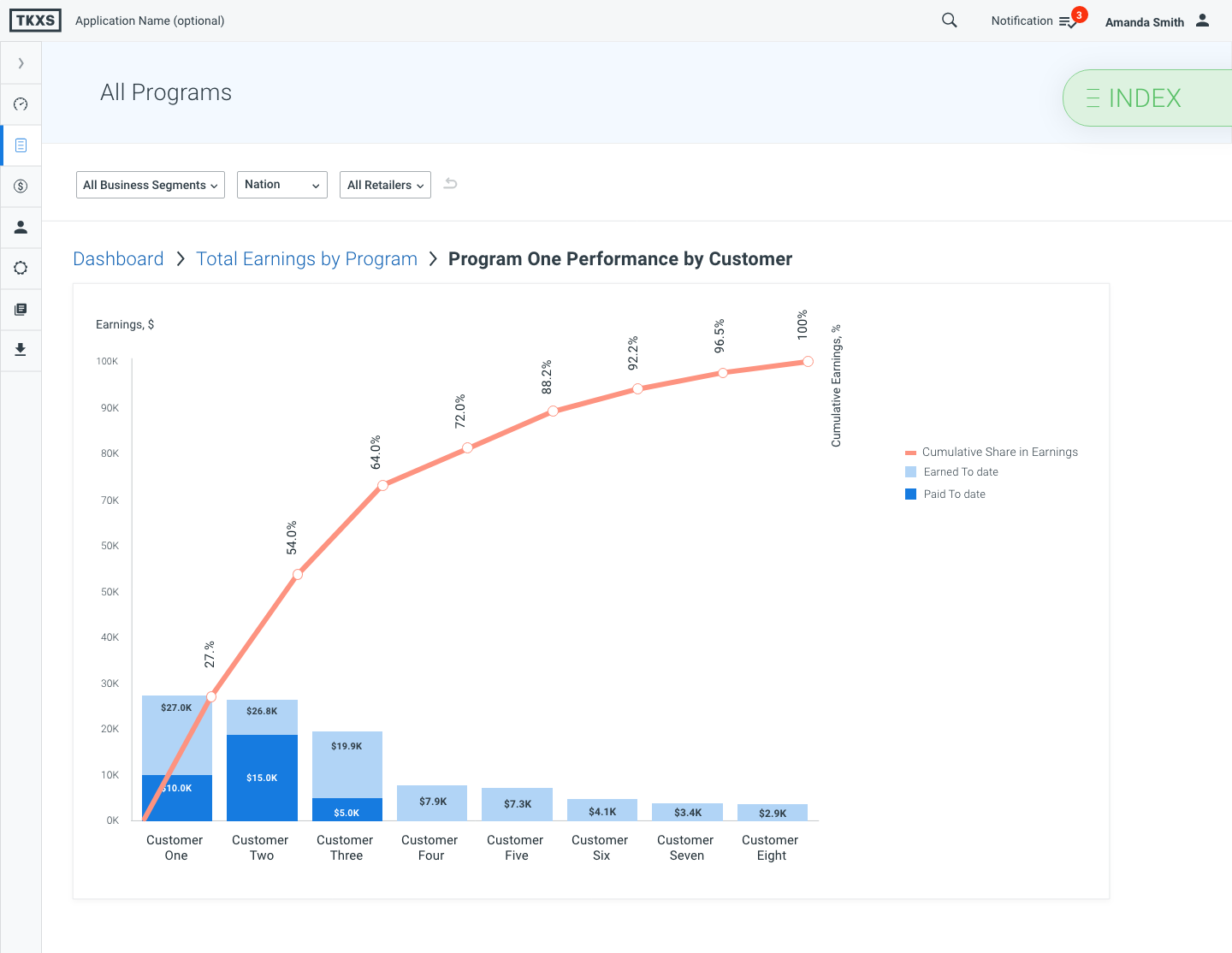
I had an opportunity to work with multiple data sets and see how we can magically slice and dice the data switching the perspective to make the insights more readable and obvious. Doing that, I got exposed to multiple aspects of data visualization, that allowed me to analyze the visual components and turn them into a system.
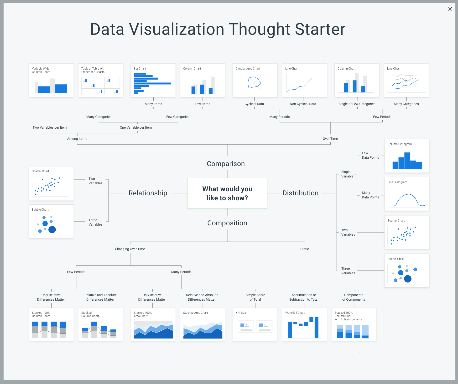
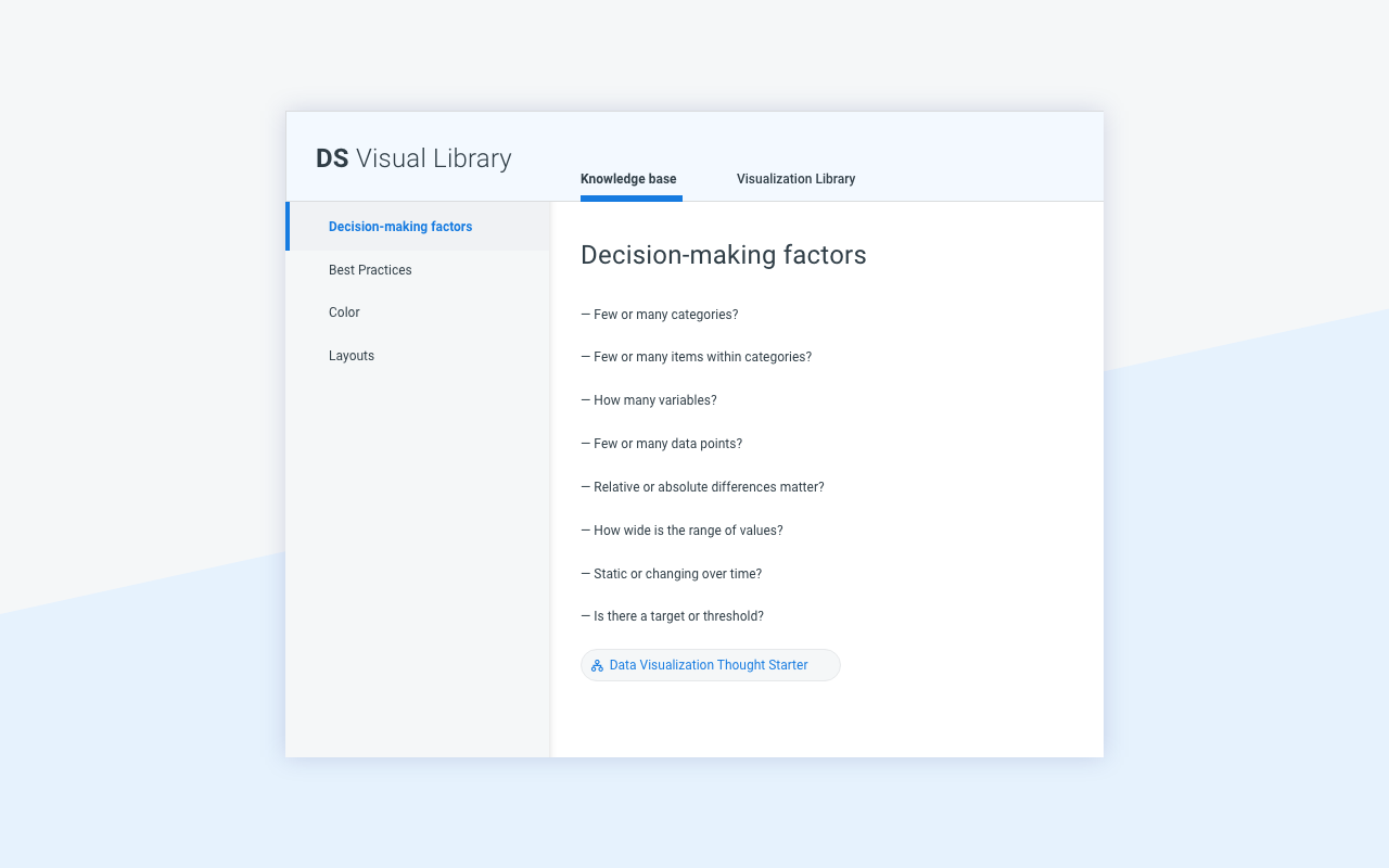
The image below shows the high-level decision-making factors.
And then I started working on the standards, that by all accounts elevated our Data analytics dashboards to a wholly new level.
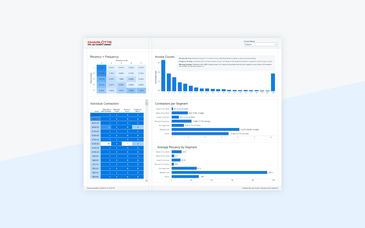
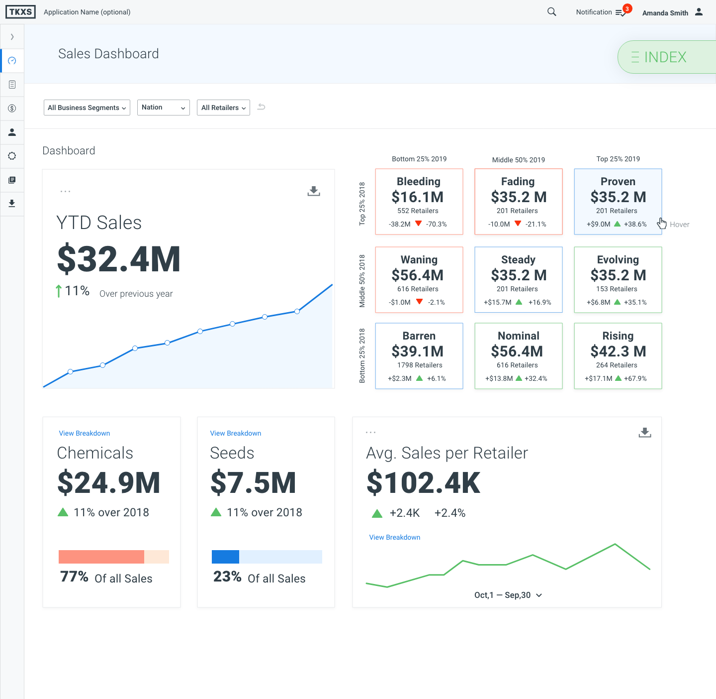
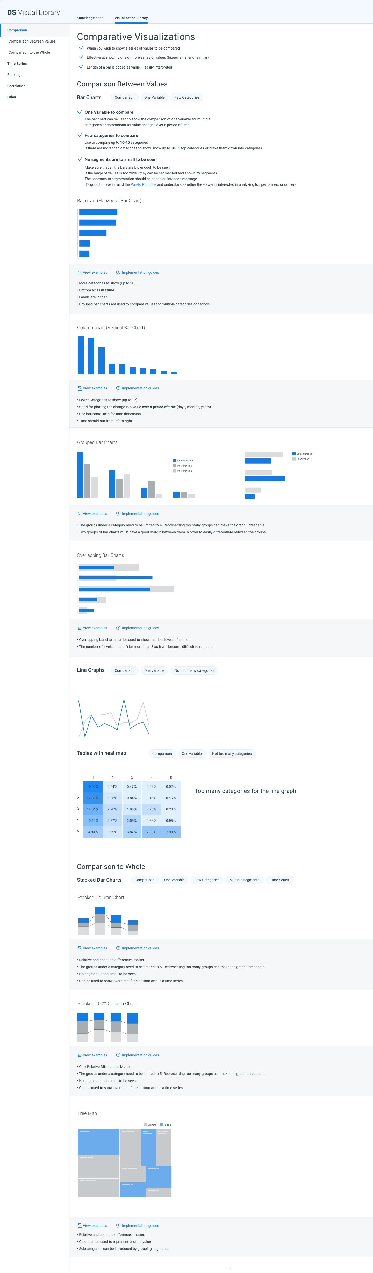
I grouped all the visualizations by function and described 'Do's' and 'Don'ts'. The example below shows how one of the section was laid out.
I grouped all the visualizations by function and described 'Do's' and 'Don'ts'. The example below shows how one of the section was laid out.
A key to understanding how to build concise, visually appealing, glanceable dashboards is applying Gestalt principles of perception, that I shared with the data science team.
Going forward, our designers can use the general structure and continue growing the library by adding the new components and real-life examples to the corresponding sections.
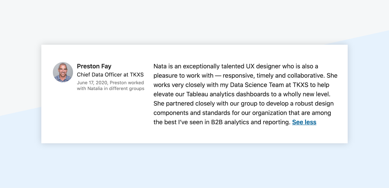
To summarize the topic, I'm going to cite my colleague, Preston, the head of our Data Science team, who mentored and encouraged me throughout my journey:
Going forward, our designers can use the general structure and continue growing the library by adding the new components and real-life examples to the corresponding sections.
To summarize the topic, I'm going to cite my colleague, Preston, the head of our Data Science team, who mentored and encouraged me throughout my journey: